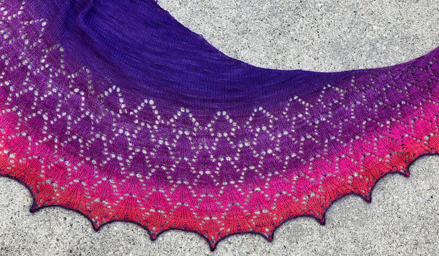
I blocked the Heaven Scent shawl last weekend, and the lace opened up beautifully!
I still have to sew in the ends, but it was a good day for pictures.
It blocked out to a really nice size. It’s about 20″ deep at the middle back, and that long curved edge is about 84″ long.
And one last detail shot. 🙂
There are three more shawls in this pattern bundle. One is rectangular, so less interesting to me, but I’ll have a hunt through my stash for candidates to knit the other two crescent shawls.
I haven’t knit a shawl in a while, lace or otherwise – well, I’m still plugging along on my Water shawl, but it’s not a very fun knit at this point. I don’t think it counts anymore. 🙂
A LYS had Freia Handpaints yarns on sale, and I simply can’t resist gradient dyed yarns. I ordered some and cast on.
I chose a pattern by BooKnits. I wanted to knit a lace shawl with some beads and I had The Close to You Collection of patterns already. (That’s a Ravelry link.) I had knit Snow Angel from this pattern collection, also in Freia Handpaints yarn, but in their Wool/Nylon Lace which is discontinued. The colourway was Autumn Rose.
This time, I’ve chosen the pattern Heaven Scent, which is in that same collection but also available on its own. (That’s a Ravelry link.) I’m knitting the smallest size, with the stockinette stitch top.
The camera is really emphasizing that hot pink. The colourway ends in a bright red.
Of course, it’s curled on the circular needle in the opposite direction of its shape – the shawl will be a crescent curved the other way when it’s off the needles and blocked. (Much like Snow Angel, shown above.)
The yarn is a loose single ply. It’s very soft but tougher than expected – there is the usual thick-and-thin of single ply yarns but it hasn’t been splitty to knit and it hasn’t broken.
And here’s a detail view. I’m using 6/0 purple Czech glass beads in dark purple, which match the beginning of the gradient pretty well.
I did make a slight change to the pattern. The shawl grows quickly in width because you add four stitches on every right side row and two on every wrong side row. The additions are at the beginning and the end of each row, and the pattern uses make-one (slanting left or right). I found that two M1s with just a knit stitch between them, then another M1 on the purl side pretty close by made for a tight edge. I switched out the two M1s on the purl side for YO’s, then the outer M1 on the right side rows to YO’s as well. I’m curious to see how this blocks out. It feels better to me.
I’m almost halfway through the second repeat of the main chart, then have the border chart to knit. I’m thinking I might run out of yarn (the pattern notes that 400m is close) so if I do, I’ll have to find something matchy to finish.
You don’t have to buy many patterns for doll clothes to come across Aileen’s Petite Fashions. These patterns are hand-drawn and clearly vintage. The title is hand-printed and the instructions look as if they’ve been typed. There’s usually a drawing of the doll and garment. At right is part of the one I’ll show you today.
Something about them reminds me of “ditto” copies, which our teachers made in the 1960’s and 70’s. (Dittos were made on spirit duplicators and characteristically were purple copies. The machines were hand-cranked and had a specific sound, and the process produced a memorable scent.)
I don’t know the history of these patterns, but they seem to date from the early sixties. There are a number of APF patterns reproducing original Barbie outfits. I found a list of them, here, though the site is old and it’s not clear whether the patterns are still being sold from this site. I’ve mostly come by mine via Etsy purchases, though often the finished garment is shown in the picture and I don’t realize it’s an APF pattern until I’ve downloaded it.
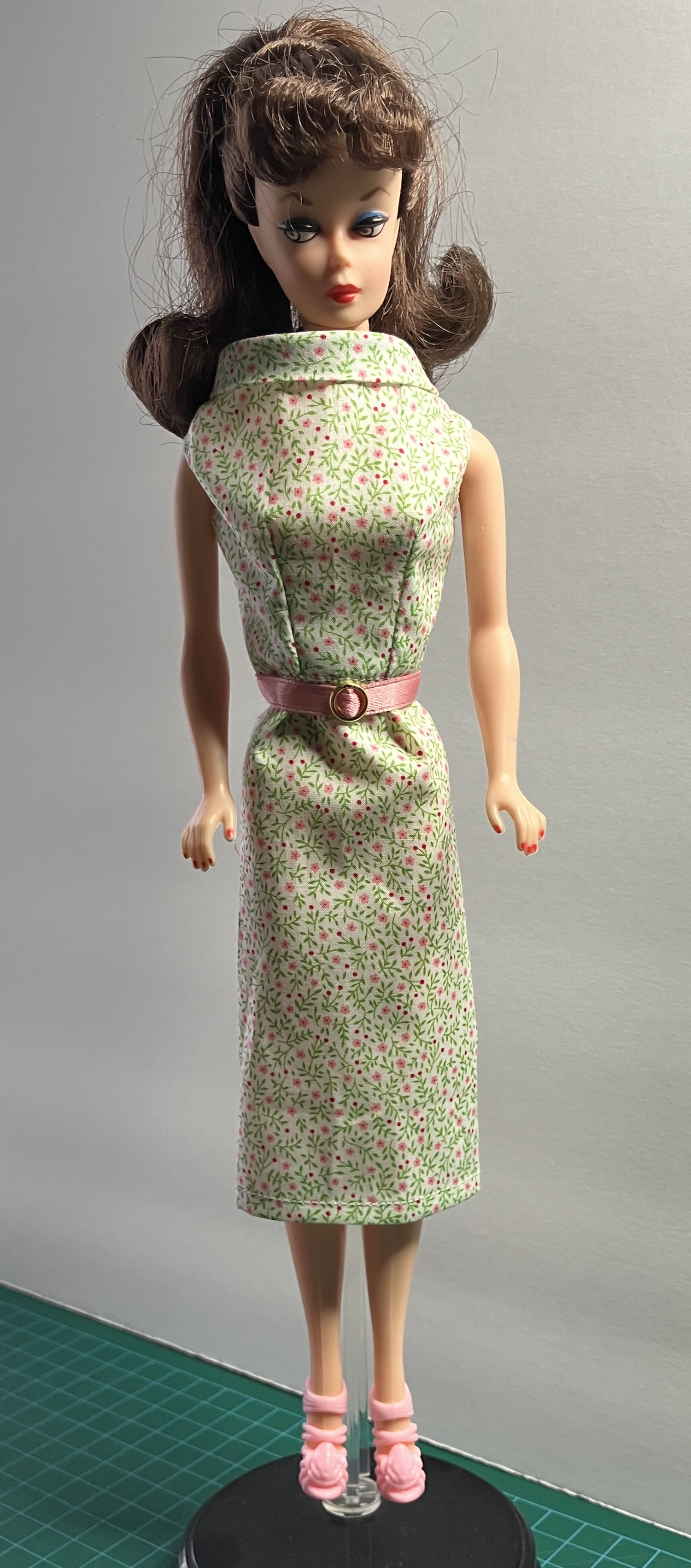
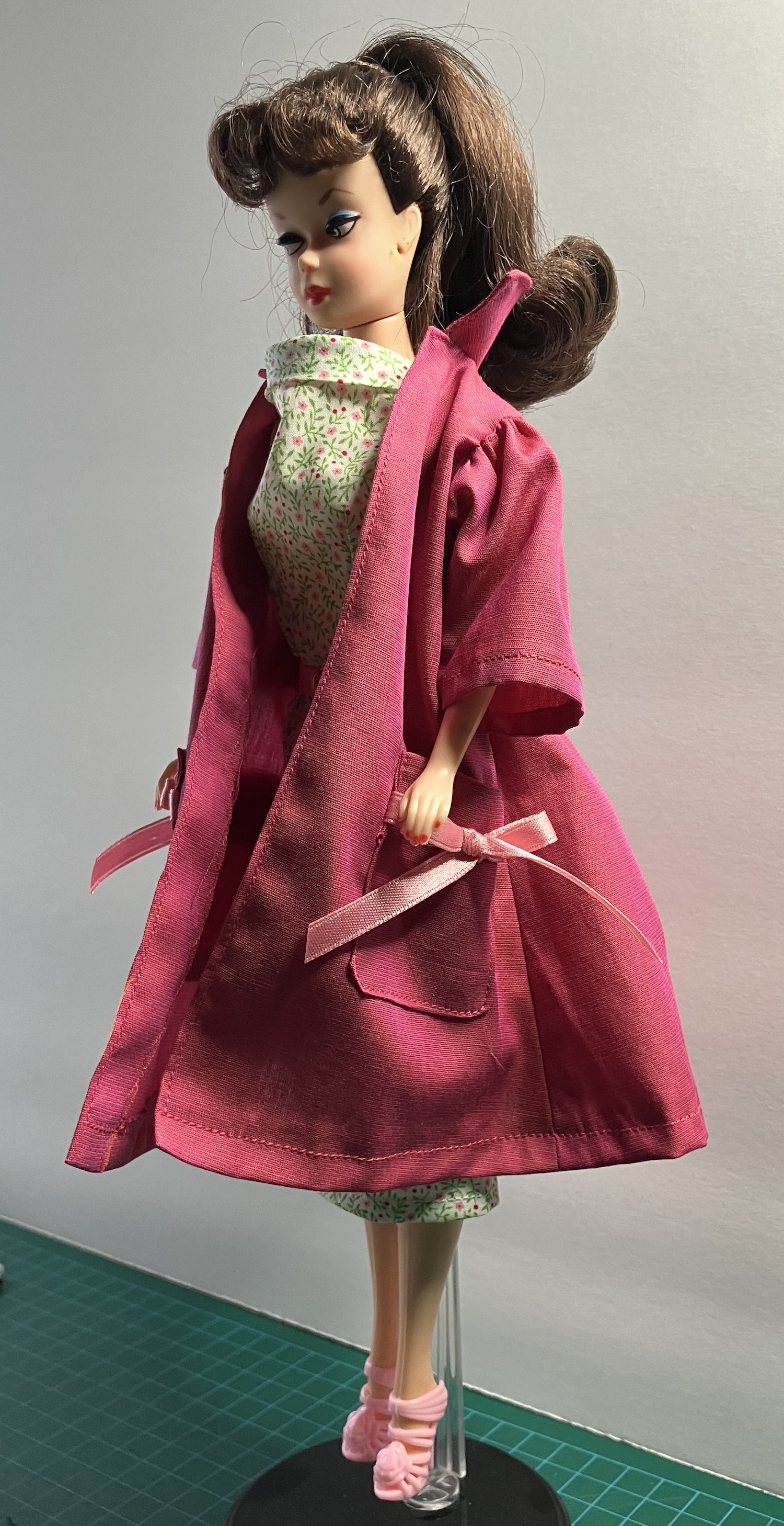
I recently made my first APF pattern. It’s APF 82 – Easter Parade, a reproduction of a 1959 Barbie fashion from Mattel. It included a black unlined coat, a print sleeveless dress, a purse and a “hat” (which is kind of a hairband, made with a “garbage tie”. Hmm.) Here’s a description on the Barbie Wiki with a picture of the Mattel original. I got this pattern on Etsy somehow, probably in a bulk pattern purchase.
And here’s my first attempt.
I made the coat of black Kona cotton. The instructions, like those on many older patterns, seem to assume that you already know what you’re on about. I used ribbons for the bows on the pockets, because I had no idea how big to cut the bias strip to make them, and couldn’t see them well in the picture to mimic the original. The coat has no front fastening because it’s pretty full. I did finish more edges than instructed and it came out reasonably well. I think it would benefit from a lining as the back collar bit does not give me joy but there you go.
Vintage B is wearing it here with a sheath of emerald satin and a pillbox hat with two feathers. (I love this little hat!) I’ll show you the sheath in another post, once I work out some kinks in the pattern.
I also made the dress from the pattern, using a teeny-tiny cotton floral print that I bought on Etsy. This one seems very generous in bodice, particularly in the upper front. I think if I made it again, I might curve down the neckline that takes the bias band. Overall, the fit is generous, more suited to “little fingers” than sleek couture.
The black seemed a bit austere for an Easter coat, so I cut another of bright pink. This is a French shirting cotton with two shades of pink that gives it a pretty crosswise stripe. (I originally made myself a shirt of this fabric. What happened to that shirt???) I added 1/4″ to the length of the sleeves to allow for a doubled hem, and again used ribbon on the pockets. You can see that this kind of collar doesn’t fit under a coat very well.
And here’s an interesting detail. I recently bought Kenneth King’s book on sewing for dolls and was intrigued that he used bridal tulle as a lining on some garments. It’s very thin, as he notes. Well, Aileen was using bridal tulle sixty years ago – the top of the dress is lined with it. It does work out quite well, making a very thin lining. The skirt of the dress is unlined.
I’ve admired this pattern from Hankie Chic for a while, and finally bought a copy. I also made it for the girls almost immediately, which is pretty amazing. Usually patterns have to wait their turn in the queue. Not only that, but I made a second one right away, in a fabric that had just joined my stash, so I’m making personal ‘firsts’ all over the place this month. 🙂
Here’s the pattern – it’s available from the designer’s website right here. There’s just the one view, although you can see that the designer did some fussy-cutting to have borders and bands in different places. I found this to be a very easy and quick make.
Here’s the first one, made of quilting cotton and lined with cotton voile. This is one of the new Barbie Basics dolls with a MTM Original body, and the dress fits her. It’s a bit looser on her than on the original Silkstone, but I positioned the snaps for the Silkie girls. I did some top-stitching on this one as the quilting cotton seemed more bulky than crisp.
One of the results of using quilting cotton for a pattern like this with a very full skirt is that the gathers at the waist add a tremendous amount of bulk. The fabric is gathered as much as it can be or close to it, and that adds a lot of fabric in the seam allowance. You can probably see a huge difference in the waist in the second version.
This one is made from a piece of silk taffeta that I got at our sewing guild’s fabric swap – yes, it was here for less than a week before some of it was sewn up. (I know. The world is wobbling on its axis.) It’s also lined with cotton voile. This one is so very crisp. 🙂
The skirt on this one is a little bit longer than the pattern specifies. Silkie has a new pair of shoes that coordinate perfectly. It pleased me that the gold vertical stripe lined up on the skirt and waistband, because I hadn’t planned that. Sometimes there are good surprises!
Part of the difference in the slimmer waist is the doll, of course – the Silkies are smaller in the waist than the new MTM dolls (and bigger in the bust), but still. There’s a lot less bulk in the seam allowance because the silk taffeta is much thinner than the quilting cotton. Using a thinner fabric – like the silk or a cotton voile, perhaps a Liberty Tana Lawn – diminishes the bulk of the seam allowances at the waist. I don’t think you can trim it much and am not sure it would matter as you’d still have some gathered skirt seam allowance. Another way to address this would be to cut a circle instead of a rectangle for the skirt, as there would be less gathering – there could even be no gathering at all, depending on the size of the inner (waist) circle. I think I may play with that a bit.
The only pattern modification I made for the second one was to move the gathers out a smidgen on the bodice. I thought the first bodice was a little ruffly at the centre front – that could be a bit of an illusion because the doll is flat there. It does make sense to have the gathers immediately under the bust. For the second, I left the first centimeter from the front edge on each front bodice piece flat, and gathered from there to the side seam. Again, the fabric was gathered about as much as it could be in that small space. Another solution would be to pleat or dart the front pieces to get the fit. There’s something else to play with.
One last observation – I’d forgotten how much silk taffeta wants to fray. I ended up sewing one centre back edge a second time – the seam allowance frayed away after I trimmed the seam, so I sewed it again, then zigzagged the seam allowance just to be sure. I dislike how products like FrayCheck make fabric feel, so the next time I cut this silk taffeta, I’ll finish all the edges before I start assembling the garment.
Around the beginning of the pandemic, I planned to get several of my tops quilted at the shop with the long-arm quilting machine. Since they were closed because of Covid-19, I popped this one onto the frame and began to hand quilt it. I don’t know if I’ve shown this one to you before.
I love pineapple quilts and picked up this book some time ago – Pineapple Stars by Sharon Rexroad. It was published in 2005 and I’m not sure when I bought it, probably at least ten years ago. (I’m also not positive that I know where it is now.) I remember that it has clear instructions and lots of inspiration, although I could have read more about contrast and fabric selection before diving into the creation of mine. 🙂
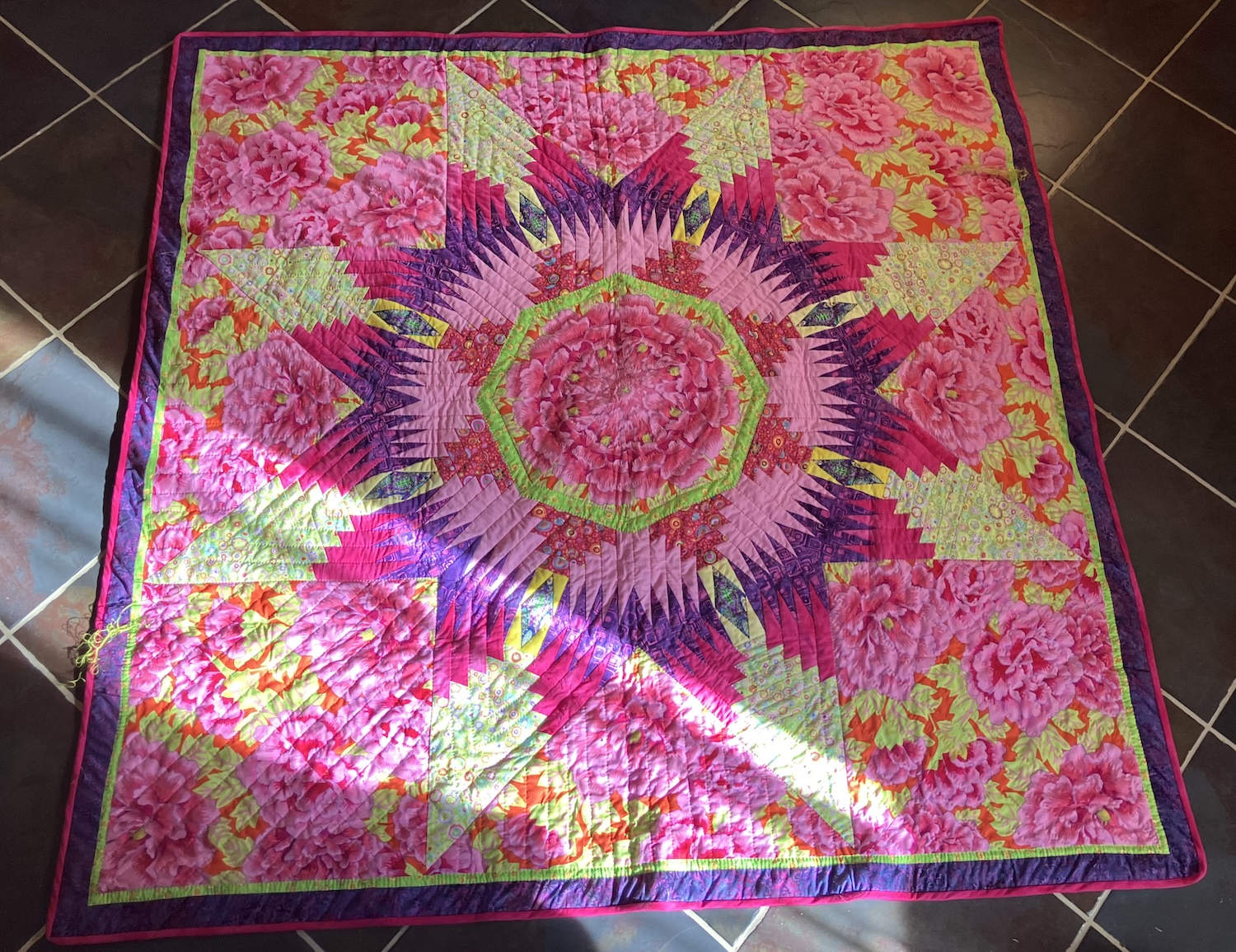
This is the central medallion of mine:
I squared off the corners and added a border. It’s very bright and I love it.
That floral print is a Kaffe Fassett design called Kimono. By the time I realized I needed big squares of it for the corners, it had been discontinued, so I pieced those blocks. You can see the diagonal line in one big peony this corner where I seamed the two triangles. It’s not an absolute match.
I started to quilt in the center with lime embroidery thread and worked my way out past that lime hexagon. There are still two corner squares that need their quilting finished.
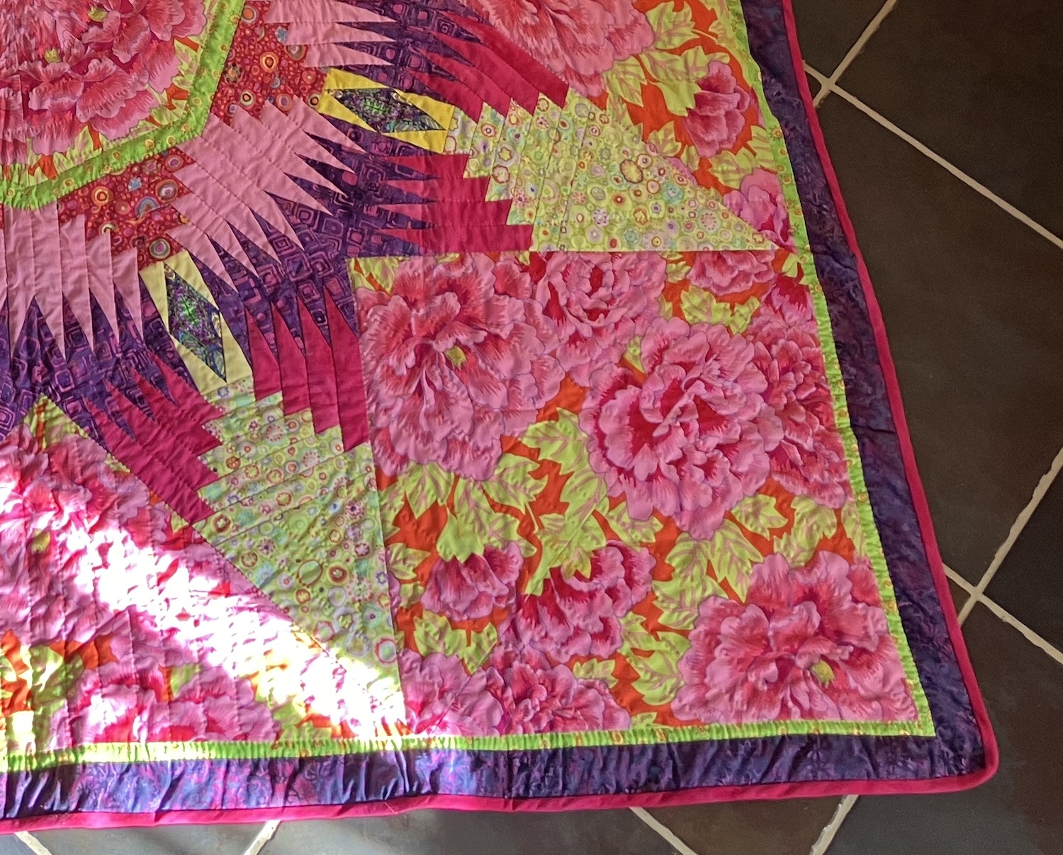
This past week, I bound the outside edge with self-made bias. I was amazed that I managed to find the dark pink from the middle of the star in my stash.
Here’s how it looks now:
It’s interesting how the contrast looks different in the photo than in real life. The green star tips don’t fade out of view as much IRL, probably because the lime is more vibrant than it appears here, more like the octagon in the middle.
As I was taking this picture, my dog decided to lie down in that bit of sunbeam. She didn’t settle in, though, so I didn’t get a pic of her there – even with the quilt, the floor is harder than her bed on the other side of the room, but her opportunism made me laugh.
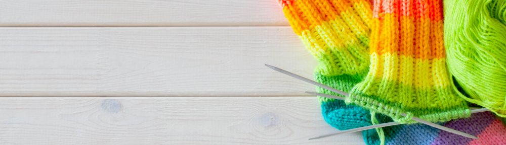
I’m working on a number of projects this week, trying to finish things up, which means I have no completed project to show you. I’ve finished the second orange sock but you’ve seen the first and (surprise) the second is the same. It’s not very newsworthy. I’ve also been knitting on the Halo cardigan while watching movies at night (the back is done). I’ll definitely run out of Koigu KPPPM on that, so need to make a plan. Hmm. (Those links go to previous blog posts here at A&K.)
Sewing-wise, I’ve finished two Schoolhouse Tunics and don’t like either of them, so won’t be showing those off. (That link goes to the designer’s site.) I finished my Purl Soho Cross Back Apron and don’t love that on me either – fortunately, the straps were long enough that I could position them for the mister. He loves to cook and the apron looks great on him, so that’s solved. It’s a good pattern, if you’re looking for one, well described and comes out with a nice finish. (That’s a link to the pattern on the PS site.) I’ve just come to the conclusion that my friend Terri is right: square pieces of fabric don’t look good on round bodies. 🙂 I’m currently in the midst of making some bucket hats. Of course, I need to tweak the patterns – I’ll show you the results soon.
This may be more interesting.
Inspired by a friend’s machine quilting, I’ve decided to learn and finish up some of my quilt tops. I ordered a walking foot for my sewing machine, but in the meantime, I’ve put this quilt back on the frame. I’d started the hand quilting and put it away. Time to finish up.
This is my Pineapple Star quilt, being quilted. I pieced this one a while ago – I know it was before we could shop easily online because I ran out of the big poppy print. I remember that the local shop that carried KF fabrics was out of stock of that one, so I had to piece one of the squares for the corners. Now, I’d just order another meter from someone else.
You’ve probably noticed that I’m quilting with embroidery thread. I like using this thread, even though it’s a bit thicker. I usually choose a contrasting colour – like the lime here – so the stiches show up. I split the thread into two strands of three ply each.
Here’s the quilt in progress, when the central star was completed, so you can see the design. I fussy cut the center of the medallion from that large scale Kaffe Fassett peony print. (The print is actually called Kimono. It’s fabulous, but discontinued.) The only other KF fabrics in the top are the lime green at the points of the stars and the cherry red outside the lime green ring – both are the same print, Roman Glass. The purple is a batik, the dark pink is kettle-dyed, the light pink is a solid (probably Kona, because it’s thick) and the lime green is a fun print with suns. There’s yellow Kona in the central squares in each point, with a leaf fussy-cut from another print in each one.
After this, I added additional triangles of the poppy fabric to the corners to square it up and added outer borders. It has a skinny border of that lime green from the middle and then a slightly wider border of purple batik – not the same batik as in the middle, since I’d run out of that too. (You may have guessed that this quilt wasn’t planned in advance.) I have some of the cherry Roman Glass cut on the bias for the binding.
The inspiration was a book called Pineapple Stars by Sharon Rexroad. Here’s the book at right and here’s an Amazon.ca link. It says at the ‘zon that the book was published in 2005, so I’ll guess that I pieced this top fifteen years ago or so.
Right now, I’ve got the big corner squares left to quilt – they’ll be quick, since I’m just doing them with diagonal lines – then the borders and binding. I’m going to try a technique featured in one of the serger tutorials I’ve been watching – the instructor uses her serger to trim the outer edge of her quilts while sewing one edge of the binding in place at the same time. I’ll handsew the other edge on the back side.
I like this quilt. It’s bright and cheerful, just the kind of thing to work on right now. What do you think?
The problem with finishing big projects is that I haven’t had much to show you. You’ve seen enough in-progress pictures of everything currently on my needles.
I did make a pair of socks, though. There’s something particularly cheerful about self-striping yarn in bright colours, isn’t there?
Of course, I had to make them match. 🙂
The yarn was in my stash – it’s Online Supersocke Comedy Color, and the colourway is 1280. The yarn is discontinued, so that’s a Ravelry link.
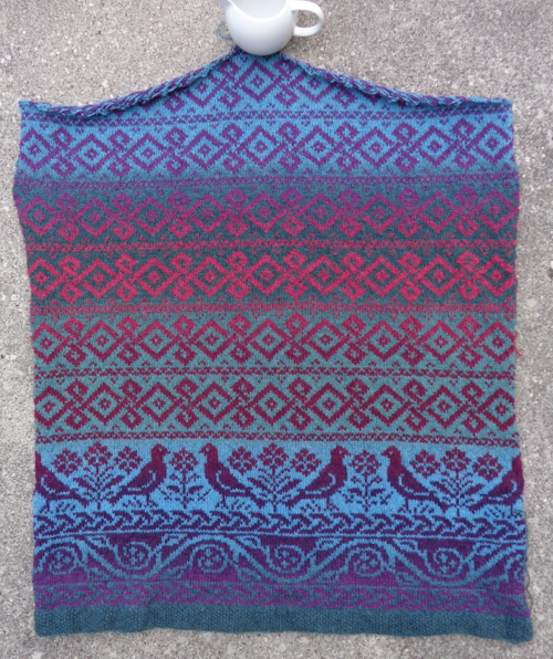
So, it’s been a while since I put this fair isle project aside, but I dug it out last week (after finishing my KSH Stripe cardigan) and have now finished the back. Here it is:It’s curling a bit because it hasn’t been blocked yet, but is really a big rectangle, decreased in to a point at the top in the middle. It’s supposed to be oversized and is big – the back is 26″ wide. I took this picture outside, and the colours appear a bit more zingy than they are in real life.
The pattern is called Roan from Rowan Magazine #56. (I posted about this project when I began it, right here.) The cardigan is like a kimono and is supposed to be knit in thicker yarn. I had this Kauni Effektgarn in my stash so recalculated and cast on in this instead. This is two colourways of the Kauni, and the yarn changes colour graduallly as you knit. (The original design uses a number of colours, and the knitter changes yarns as knitting.) Because the yarn is thinner, I had to do more repeats of the band with the diamonds to get the sweater to the right length – I decided to make it a bit shorter than the pattern, to ensure I wasn’t overwhelmed by the sweater.
The two fronts together are the same shape as the back, just split down the middle. Because I want the colours to change the same way on the front and the back, I’m going to knit the fronts as one piece, then cut them apart. This is called steeking. I’ve never done a steek before, and the prospect of cutting my knitting does freak me out a bit. I have a lot of knitting to do before it’s time for that, though.
I finished this sweater last week and just love it:This is the Hebrides cardigan pattern (a free download from the Rowan yarns website) knit in Kidsilk Haze Stripe. This is the Cool colourway. (The pink isn’t quite as bright IRL as it appears in the photograph above, btw. ) When you look at the pattern on the Rowan site, you can see from the styling that the ease is calculated for you to wear the sweater right against the skin. Because I knew I’d wear this as a cardigan over top of blouses or t-shirts, I knit one size larger and left out the waist shaping. I knit one of these before in the Twilight colourwayand knew immediately that I’d wear it all the time. (I do.) It was clear that I needed another one. For my size, it took about 2.5 balls of KSH Stripe.
I also found some perfect buttons in my stash – these were harvested from a Ralph Lauren skirt I made years ago. The skirt wore out (it was loved to death) but I liked the buttons so much that I kept them. Now they’ve finally found a new home. They’re exactly the right tones of blue – they’re a bit stripey, but that didn’t show up as well as I’d hoped.I’m going to cast on yet another of these cardigans, this time in a solid colour.
And finally some knitting to share!This is a long vest with a cable on either side of the front opening. It’s quite boxy, so these end up being short sleeves. It’s not nearly this vivid a pink, but that’s courtesy of the flash. The design is Alexis from the pattern book Rowan Colourscape Folk. The yarn should be Colourscape Chunky, but this yarn is Texere Olympia in the colourway Eros. I’d read on Ravelry that the Texere yarn was very similar and it is – in fact, it’s indistinguishable to me from Colourscape Chunky and is much cheaper. Colourscape Chunky has also been discontinued recently and is becoming hard to find.
I like this yarn a lot, both because of the vibrant colours and because it’s got a nice rustic feel to it. The colourways for Rowan’s Colourscape Chunky were designed by Kaffe Fassett and I’m a sucker for the way he plays with colour. There are definite similarities with Noro yarns in that this one is a single ply, loosely spun, and still remembers the barn. It softens and fulls considerably when the finished garment is washed and blocked. It’s also unpredictable a bit in the colourway progression – I had thought after casting on the left front that I should frog it back and start in the red, so it would match the right front. You can see that wouldn’t have worked. The pink band after the red and before the mauve-flicky bit is much broader – the section was much longer in that other skein. The right front, in contrast, has a broader red band before the green-flicky bit. It would never have matched, even if I’d tried.
I knit the vest 2″ shorter than it was supposed to be, because I’m not nearly as tall as the model in the book. Also, I wanted it very loose, so cast on the large and decreased to the medium above the waist so my shoulders weren’t lost in fabric. It worked out well, although I could have begun the decreases sooner and spread them out more.
Here’s the back:This is where I made my big modification. I added that double cable up the back – the pattern has a plain back. It’s 11 stitches wide – P1, K4, P1, K4, P1, the K4’s becoming the cables – and does pull the fabric in a bit. I also widened it into a V at the top, so the cables on the back would line up with the cables on the front at the shoulder seam. This picture (without the flash) makes the colour look more red than it is, but it’s been raining too much outside to take pictures there.
Overall, I’m very happy with the vest. It’s warm and the colours are cheerful. It was a pretty quick knit, given the thickness of the yarn. What do you think?